
Post-Unlock Analysis : Claimed


Token unlocks have been a crucial part in analyzing token supply since forever.
But not all unlocks are created equal. It is either enforced by smart contracts or human when certain condition meets: such as time (schedule), governance (community vote) read more about TBD unlocks here ,and etc.
Some of the unlocks schedule from projects is a commitment on a whitepaper (offchain). Therefore, the actual ‘Token claiming process’ is generally not match an exact scheduled time. The only case that these two things can be matched is when the unlock schedule is enforced by a smart contract. Not including the queue process that some projects has.
TokenUnlocks saw this particular problem happened frequently, and we wanted to solve it. We start tracking on-chain on some of the major tokens that our users love, indicating vesting addresses, and tracking the ‘Token Claiming Process’.
Introducing the ‘Claim Chart’ where we visualize the token outflown from the vesting address to beneficiary wallets (claimers) after unlocks. You can see clearly the proportion that each address has claimed, including its previous claiming activities, cost when claim and net flow for each address!
Unlocks =/ Claimed, Unlock event is a plan in the vesting schedule but claim is what actually happened on-chain.
Let’s get started by understanding some of the metrics here!
Claim = Total token outflow from vesting addresses
Unlocked = Total Unlocked token following the vesting schedule
Move Out = The sum outgoing transfers from claimers to other addresses excluding the vesting wallets
Net Flow = Claim Amount - Move Out Amount (This metric could be negative if the claimers has received tokens from addresses other than vesting wallets)
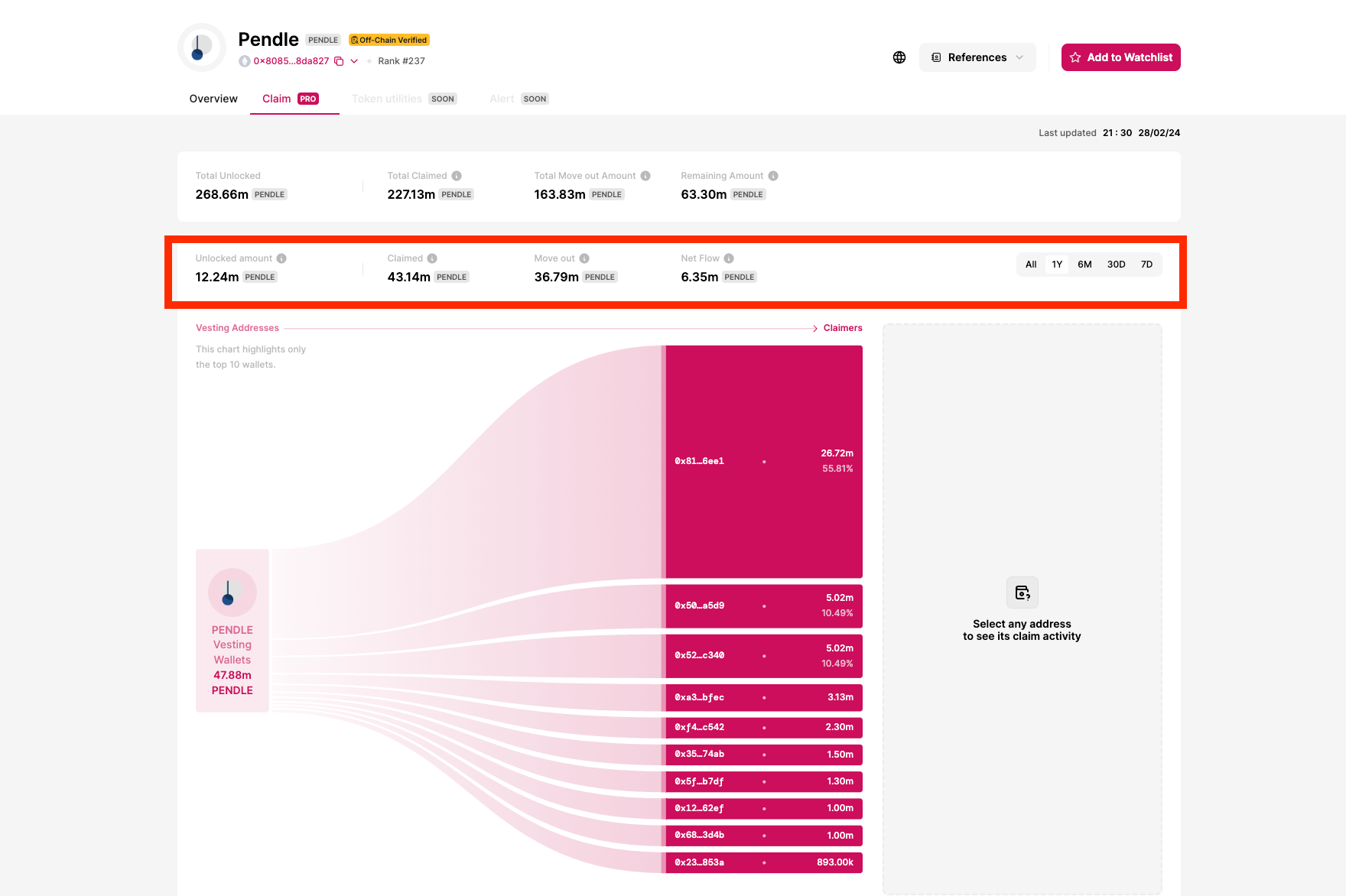
The layout shows 2 rows of these metrics. The above row is all time data and the below row is the data from the timeframe that you can select(7D, 30D, 6M, 1Y, and All). You can compare the differences and its trend via ‘All time’ data and ‘Selected timeframe’ data.
*Note that Unlocked amount and Claimed amount can be different due to claiming can occurs before or after unlock schedule. In some selected timeframe there can be no unlocks but some claim due to discrepancy of what was scheduled and action
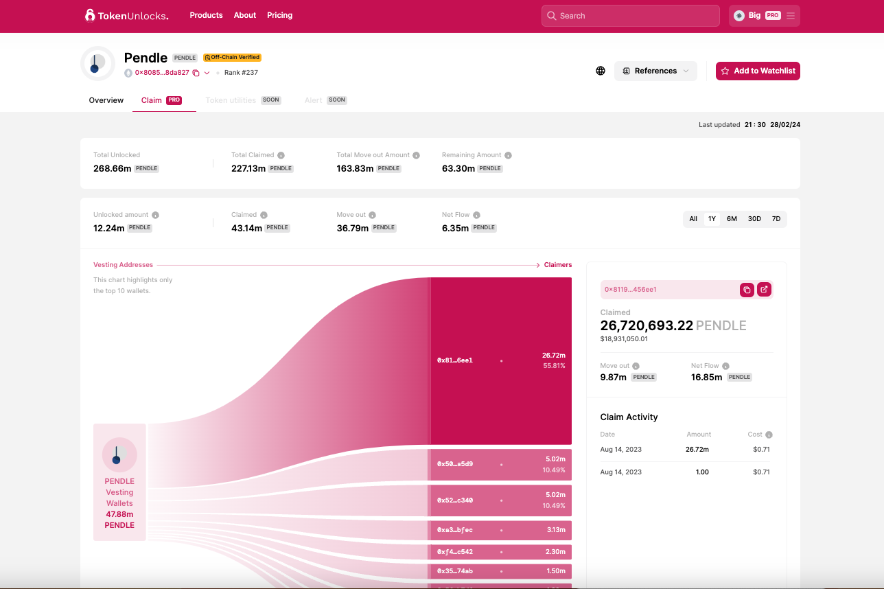
You can also see the top 10 claimers’ addresses in each timeframe. When you select any claimer address. It will show claimer's activity breakdown including date claim, amount of each claim, and cost of the claimed token(cost token at each tx.). Also sum up to show how many % the claimer is still holding by "move out(transfer out after claim)' and 'net flow(claimed-move out) metrics.
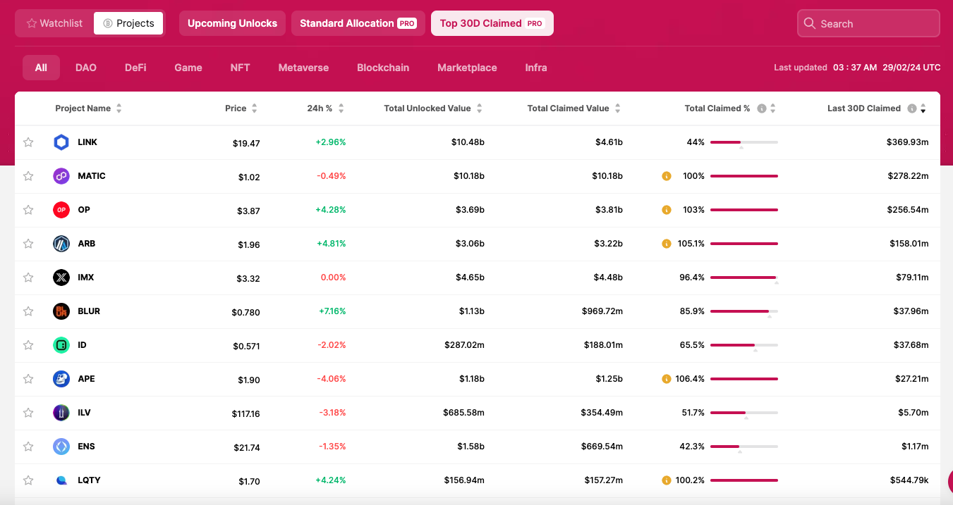
This Top claim page is the starting point for Claimed feature, where you can find all of the token that has this feature. The default setting is top 30D claimed amount. Total Claim Percentage is one of the key metric is this page where you can see how many token is available to claim, allowing you to understand the behavior of investors and other beneficiaries of that specific token whether they’re still holding or doing something with their funds.
Here is the metrics definition
Total Claimed Value = The USD Value of total token outflown from vesting addresses
Total Unlocked Value= The USD Value of total Unlocked token from the vesting schedule
Total Claimed % = Percentage of Total Claimed Value / Total Unlocked Value
*It is possible for the tracked total claim amount to exceed total unlocked amount due to unlabeled internal/operational transfers by the team
Last 30D Claimed = Token outflown from Vesting Addresses in the past 30 days
We hope this feature helps you understand the token supply and analyze it better than ever. Please find the list of all token that we have developed claim chart here. This feature is for Pro users only!
Explore TokenUnlocks Pro here